It’s all about relationships. It’s all about people.
See also:
Church postcard design
Colourful church event flyers
Easter Church Flyer Design : Jesus Updates Facebook
This is my boringly repetitive 8 word summary when it comes to advertising or marketing my church. It’s all about relationships – between us and God, and between ourselves.
A model of vertical and horizontal relationships in one. These relationships are between people. For me, this is an intimate, personal, and should be very close set of relationships.
A lot of the time church flyer design is either an abstraction in the form of landscapes, lights (bokeh), and plain text with block colours, or a favourite of many churches: the rock concert (eww).
This makes the designs feel distant, too inaccessible, or just not related to what is happening on any given Sunday – the idea of relationship with a loving, caring God.
Both of these forms of marketing to me at least have very little to do with the day to day wonder of church. The real close intimate relationships that develop around a common love of Christ. A common experience of life. A common goal, of running with perseverance the race marked out for us.
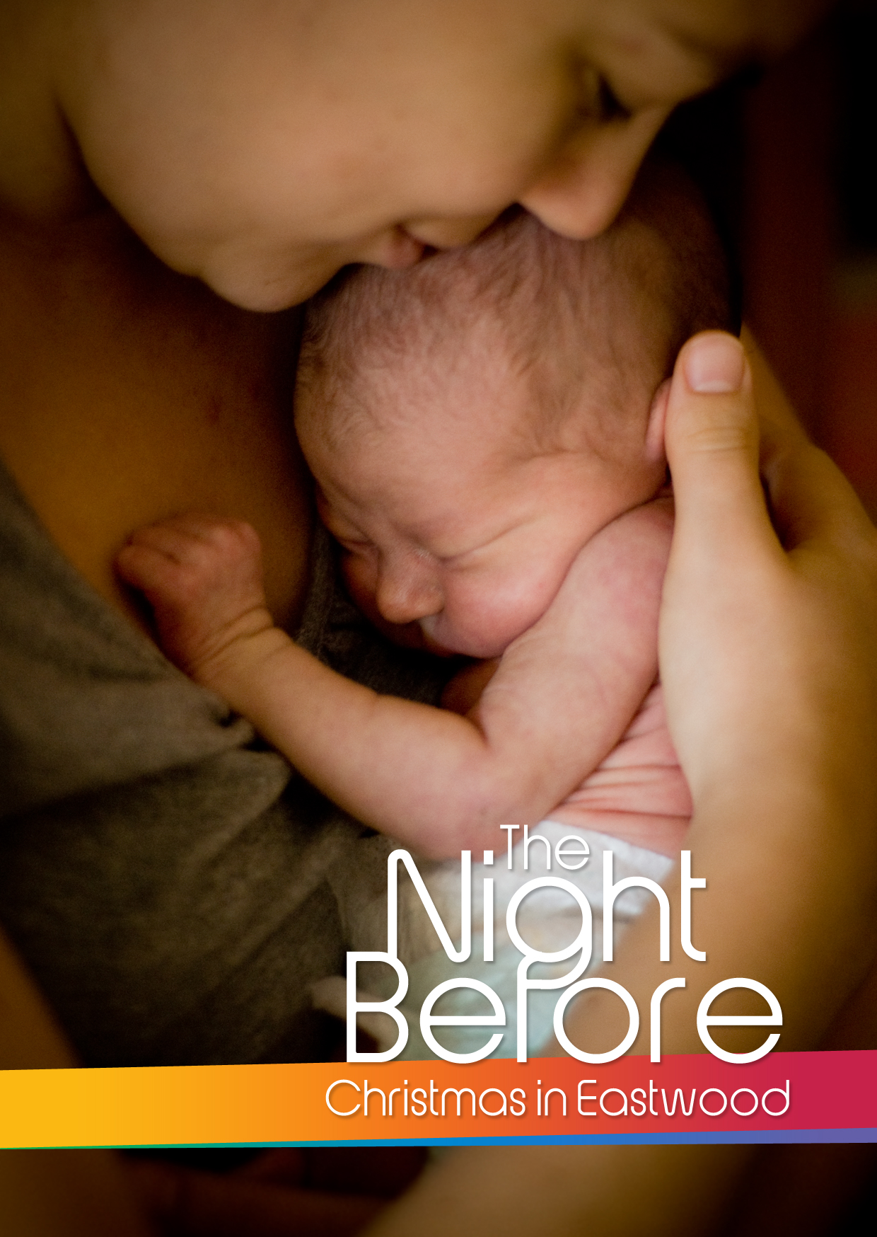
So in that mind I wanted to create something for Christmas at least, that moved to a deeper feeling of relationship. And in step with the Christmas story, it was a mother and child. A picture of intimacy that really drives to the affection of God for his people. I thought this would work on a more abstract level as well as tying in to the obvious Christmas theme. I’m guessing though that people skipped the abstract and went straight for ‘Mary and Jesus’. It in fact was my wife and daughter of 4 or so days.
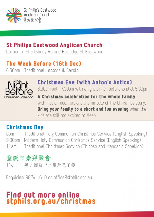
Turns out people connected with the flyer, there was feedback that people came to church at Christmas just because they received the flyer in their letterboxes. I was more than happy to hear that! It’s good news to me when something works to entice and bring people to hear about Christ.

Here’s a few ways which I think generally design can be easily implemented for any church wanting to be seen as relational.
- Use photos of real people in the church.
- Speak relationally. Don’t use organisational language or jargon that an outsider would find hard to understand or connect with
- Have a target audience. ‘Everyone welcome’ is so weak – find out who would want to come and give them a good reason to, or nobody will.
- The church is not a building, it’s the people. Forget about how impressive your building is.
- If you can, find interesting people in your church that other people would connect with, and introduce them to your community. It could be just one photo of them (like above).

