
This series of designs has been proposed to my church, for the event called ‘You’. Each design to be printed as a digital photo print, handed out individually to friends and neighbours of members of the church.
Some of the detail behind the series:
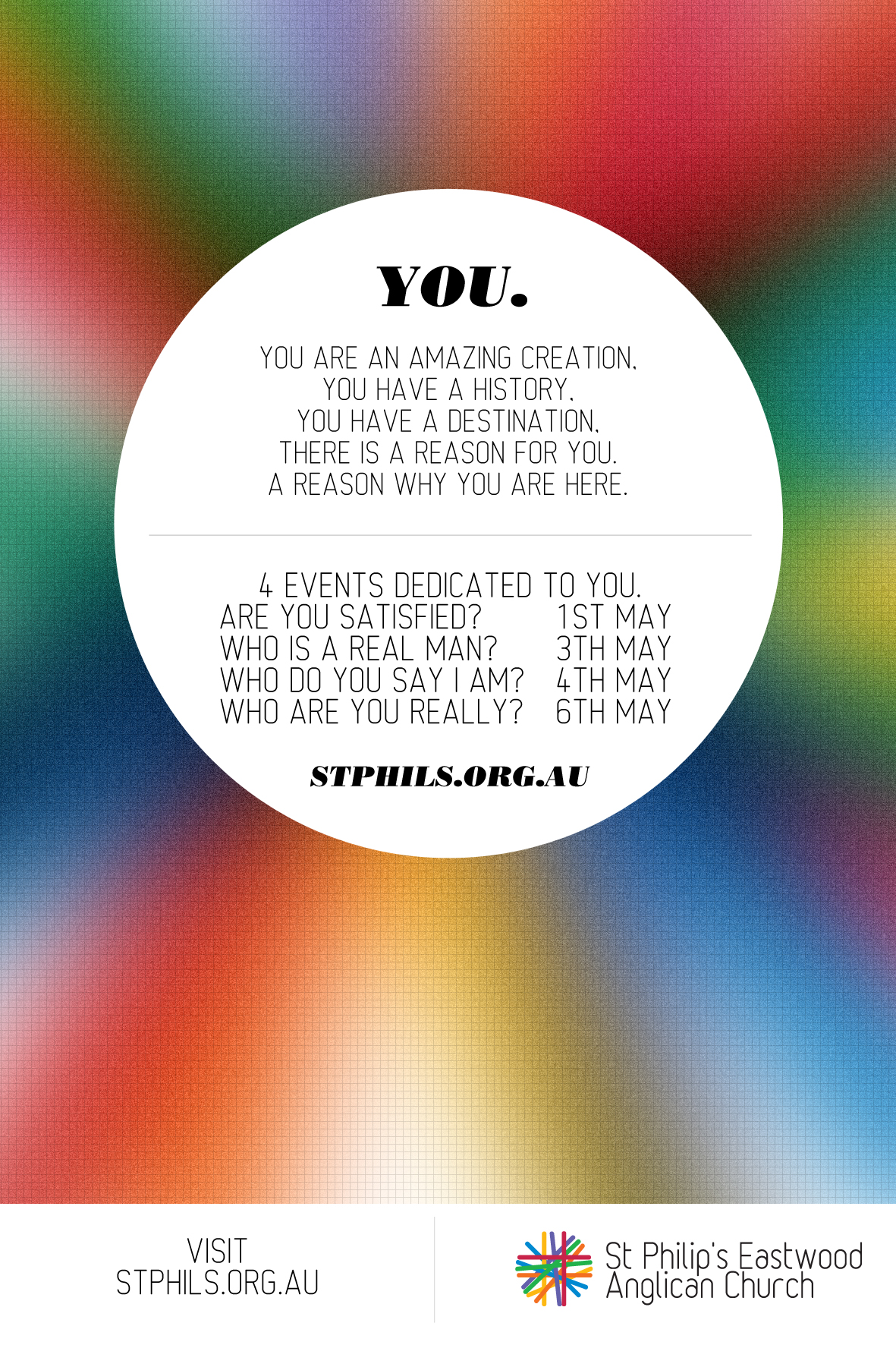
- The design is based off the idea of connecting people.
- Colours in the overlay and intersect each other, leaving behind traces of this intersection by a change in colour.
- Within/under these coloured stripes is the theme of each event (Jesus: crazy or king = king vs jester cards).
- The colours as you can see are tailored to the target market of the event. Male/female colours, greens for outdoors, red and strong colours for youth, combination colours for a mix of everybody.
- A fixed design element is generic detail about us. Our logo and our URL.
- The center circle holds the eye and the detail. I’m using Bodoni in the heading as it can be gender neutral and 232MKSD in the body, as this is an easy, light and friendly font to use.
I’m currently pretty chuffed with the result of my work from an aesthetic standpoint, however if it fails to attract people or entice, then ultimately it won’t be of much value.


