In January each year, my church runs a week long camp for school years 6 – 12 kids called Full On. It’s known to be as much fun for the leaders as it is for the kids, and with a ratio of almost 1:2 leaders to kids, it’s a pretty sweet deal. It has been running for over 10 years now, with a great amount of effort and love put in by the various leaders and directors of the camp.
Each camp has a theme, which is used by the leaders as ‘scaffolding’ for activities, talks and bible studies.
I get to do fun things like design logos for it.
2013’s theme: Detectives.
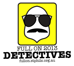
 I had multiple ideas for the logo this year, from simply copying text like Dick Tracey to putting in Sherlock Holmes’ pipe and hat. None of these seemed that interesting for a fun, vibrant, and active camp. So I took inspiration from far less glamorous detectives – those overworked and underpaid, poorly dressed detectives in 70’s and 80’s TV and movies. You can see below:
- Magnum P.I.’s moustache
- Aviator sunglasses
- A police/detectives badge as the head of the man
- American Typewriter font to help with the ‘gritty’ feel of it
I think the combination is pretty nice, including the bright yellow for kicks.
There are two arrangements of the logo, I think I prefer the tall one but the wide works in most uses.

