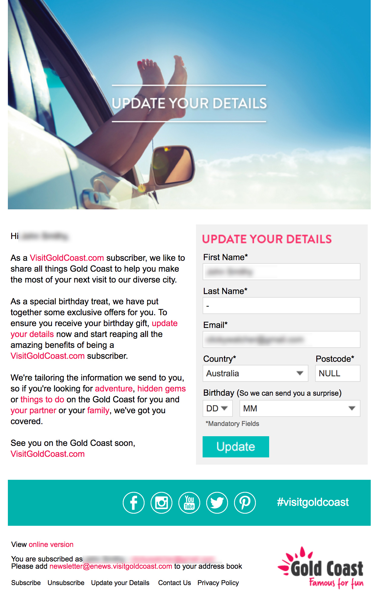
The ‘form’ shown in the email below contains data that encourages a subscriber to update their details. Upon clicking on the form entry, or item it takes the subscriber to a landing page where a subscriber can input/update their details.
For some this is deceptive behaviour
Some people think that forms in email are not real, they don’t represent a true user experience so when you click on them and they take you to another place, they’re being deceptive. As a result brand equity is diminished, and trust with the brand is eroded.
Others are okay with it
Maybe it’s simply a way for you to get the recipient to take an action, and we often step people through multiple step processes. When you go to shopping carts, or go through multiple step signup forms that reduce big tasks into smaller steps.
What do you think?


