
Over the years I’ve made a few church Christmas flyer designs for St Phils. Over that time, I’ve seen the most popular service for Christmas move from the morning of Christmas day to a Christmas Eve service that is hugely popular with busy people who have lots to do on Christmas day.
I received instruction that we were to advertise this Christmas Eve service to our local area. The choice was for a letterbox drop with an a5 flyer/postcard in the weeks proceeding. I don’t favour letterbox drops, because I think they’re a scattergun approach to marketing – but I needed to come up with something to capture and keep the attention of the recipient amongst all the Christmas letterbox advertising. Other church Christmas flyers from local areas have been more traditional with candles or just plain ugly – so the design could easily stand out.
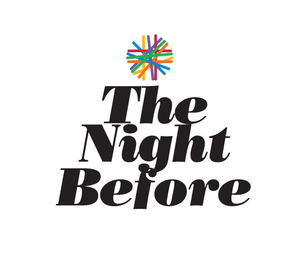
With web development (my primary job) you have maximum 2-3 seconds to convince someone to keep reading (exceptions exist, like this website exist of course). So I went for a title ‘The Night Before‘, thinking that it would tie into a common Christmas phrase and link to the details of the service. I reckon it works nicely.

Without any particular budget to speak of, I went for a simple text based design:
- Shaping the headline into a Christmas tree style arrangement
- Using bold black text for the headline and a splash of colour on a white background
- The ‘star’ on top of the tree is drawn from what is now our Church logo
- Lots of white space to keep the design clean and to a single focus.
I think the design is attractive and easily understood. I *hope* (and I really have limited feedback) that this provides some incentive for people to come.